Project overview: Herbal Inventory Manager
I began this personal project in Februrary of 2023 with ideation and finished my High-Fidelity prototype in June 2023. I went through wireframes and low-fidelity prototypes to user testing amongst local stores and café’s in San Francisco. I then created a design system, various possible mock-ups, and iterated until it evolved into a high-fidelity mock-up I was happy with.
Timeline:
Five months
My Role:
UX Designer
Collaboration:
Self
Platform:
Figma
Problem Summary
No business can go without managing their inventory. Yet manual inventory counts are tedious time sinks and are often inaccurate because of POS or eCommerce sales. Small businesses lose the most time and resources due to poor inventory management.
Solution Summary
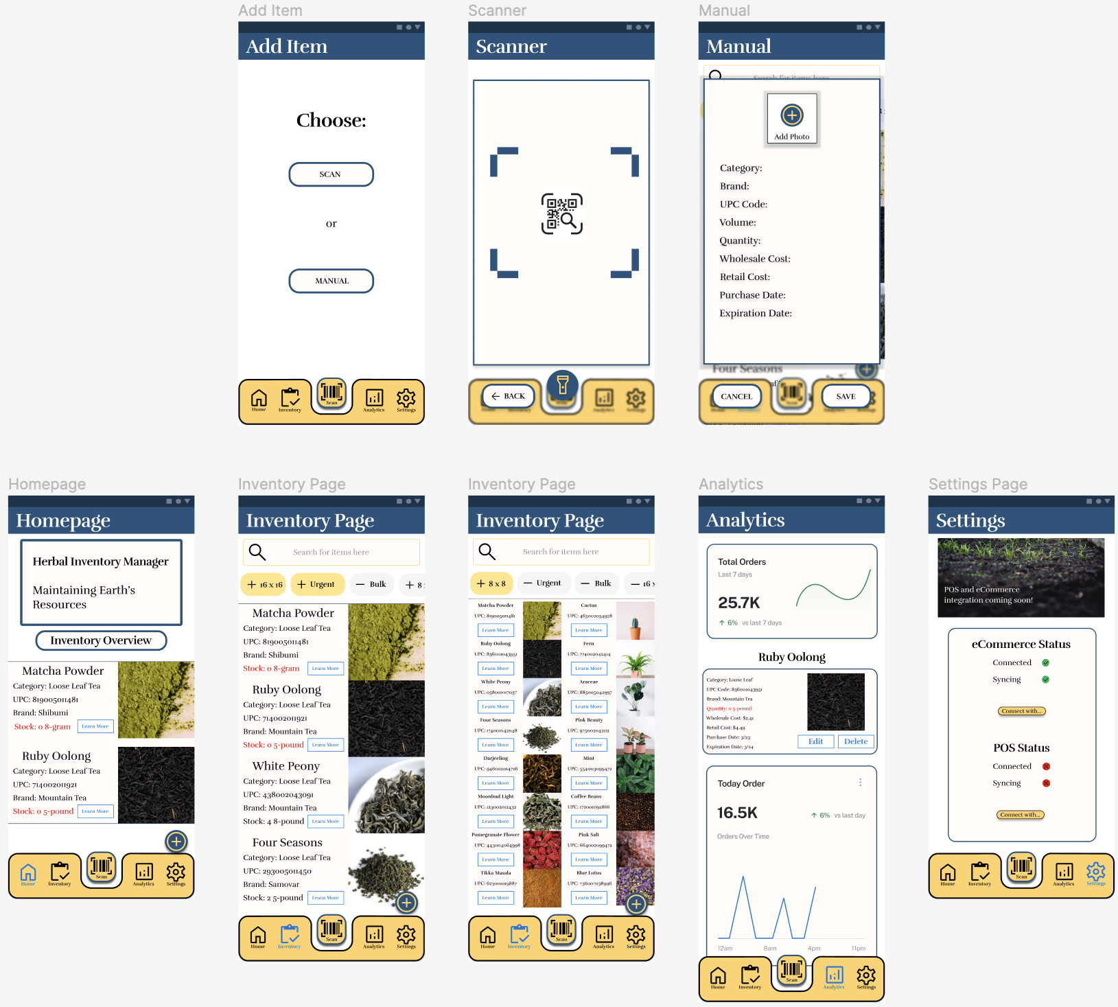
I designed an inventory app with phone scanning capabilities and urgent notifications. The rest of the inventory manager is as simple and straightforward as it can be to make the stressful experience of managing inventory, easeful and compact.
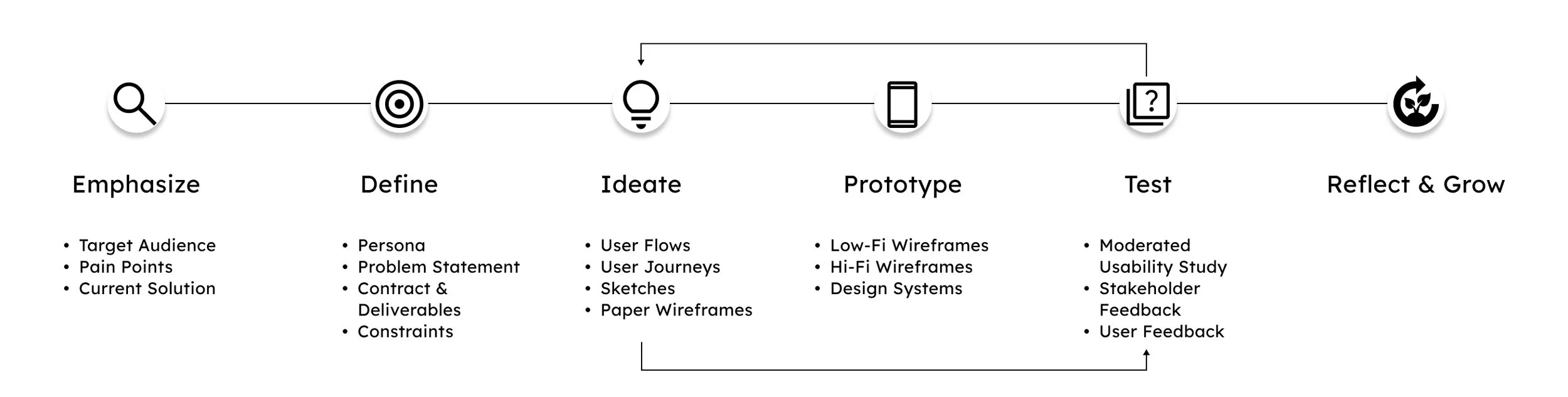
Process
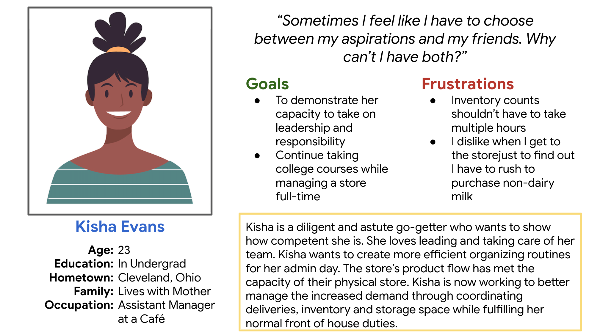
Persona
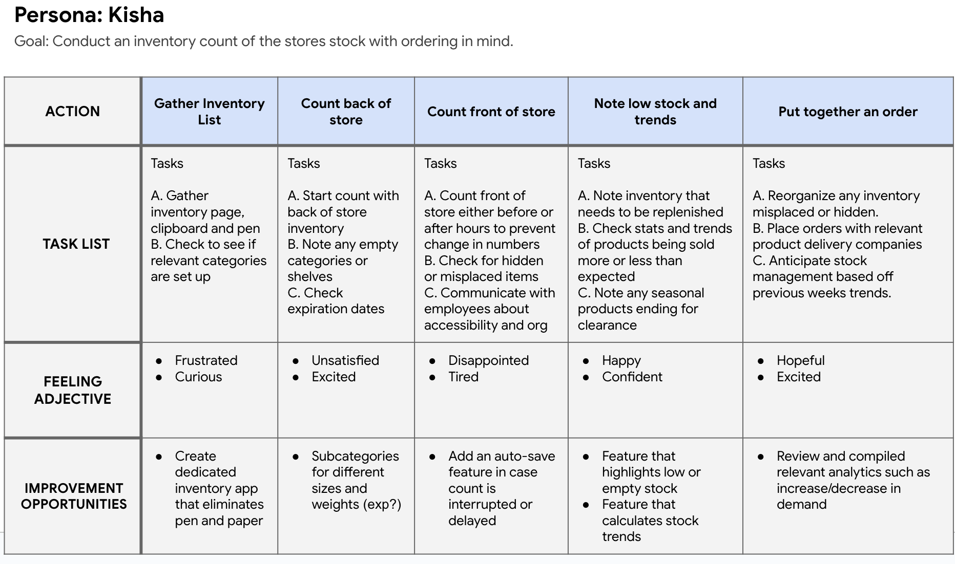
User Journey Map


Paper Wireframes
For my paper wireframes, I wanted to explore potential layouts and ways of organizing information. I knew my user flow would be atypical so I needed a homepage that could easily navigate to the inventory and analytics page.
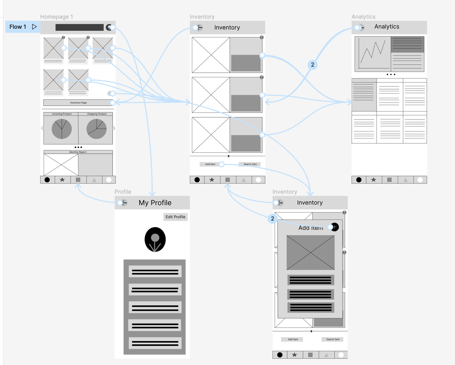
Low-Fidelity Prototype 1.0
This was the first prototype to undergo user testing. I wanted to test how users chose to navigate between screens and if my buttons and navigation met user expectations.
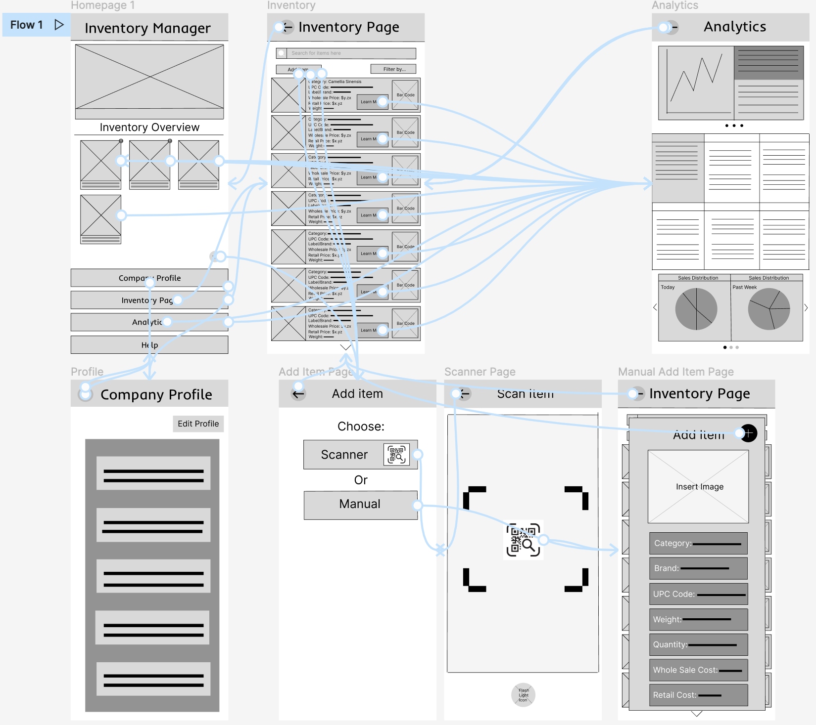
Updated Low-Fidelity Prototype 1.5
2. Users need POS and eCommerce integration
If inventory counts are going to remain accurate and relevant for managers, it needs to update based on POS and eCommerce sales. If the inventory app is unconnected from other software, the inventory page only remains accurate the day inventory counts are conducted.
4. Users found the homepage confusing
The homepage contained an inventory overview and relevant statistics. I found in my user testing that the amount of information on the homepage delayed and slowed users down to their goal. At this point I recognized that, unlike social media, users should not linger on the homepage. I decided to extra information on the page the user would expect in order to not distract them from their intended goal.
Design Insight and Changes
I made four main design changes based on user feedback when I conducted my moderated usability study.
1. Users wanted a phone scanning option.
By this point in the design, I found a phone scanning option integral to the needs of the user. In my original design I felt certain that an inventory count that didn’t include a phone scanner would take just as long as a manual inventory count.
3. Users wanted inventory filtration options
Users requested different options to filter through the inventory page. As long as the UPC code is present, I could provide a macro glance to as many inventory cards as possible.
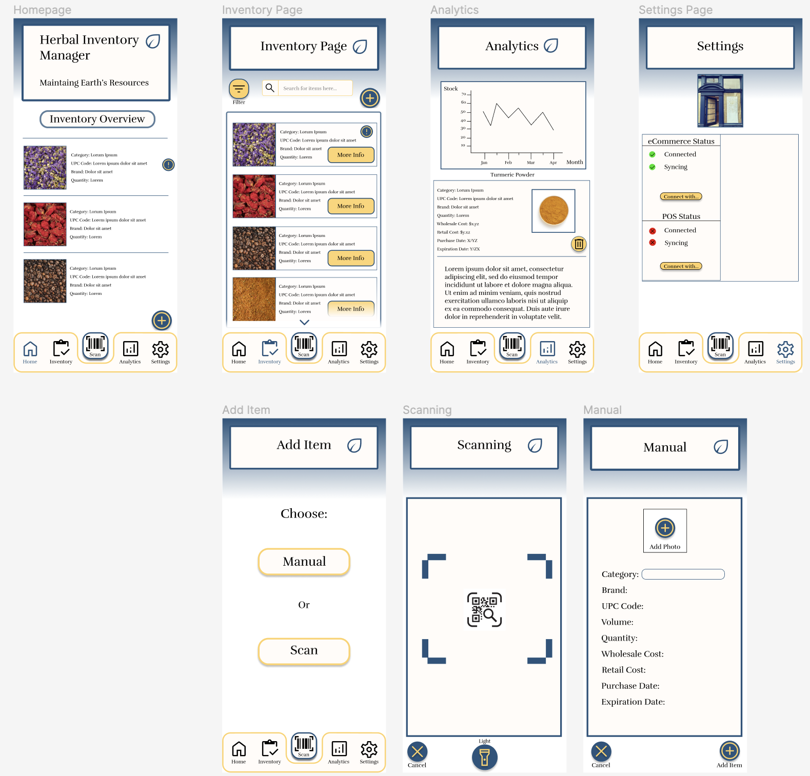
High-Fidelity Mockup before testing
My high-fidelity mockups went through a series of evolutions. This first revision displayed a rough estimate of how I envisioned the design elements.
2. The Inventory page contained too much non-vital visual noise.
As my designs matured, my original impulse to contain elements in lines and boxes reduced as it turned to be too much visual clutter. User testing also found the FAB changing locations from the homepage to the inventory page confusing.
Design Insight and Changes
I made two main design changes based on user feedback when I conducted my second moderated usability study.
1. Color Hierarchy was misleading.
I was accidentally emphasizing the “More Info” and “Filter” button with the dark gold. The navigation bar did not have enough color weight and the blue iconography representing the current page was difficult to detect. Lastly, the “Add item” FAB held too much weight on the homepage. The urgent notification symbol fell into the background easily with the dark blue.
Design System
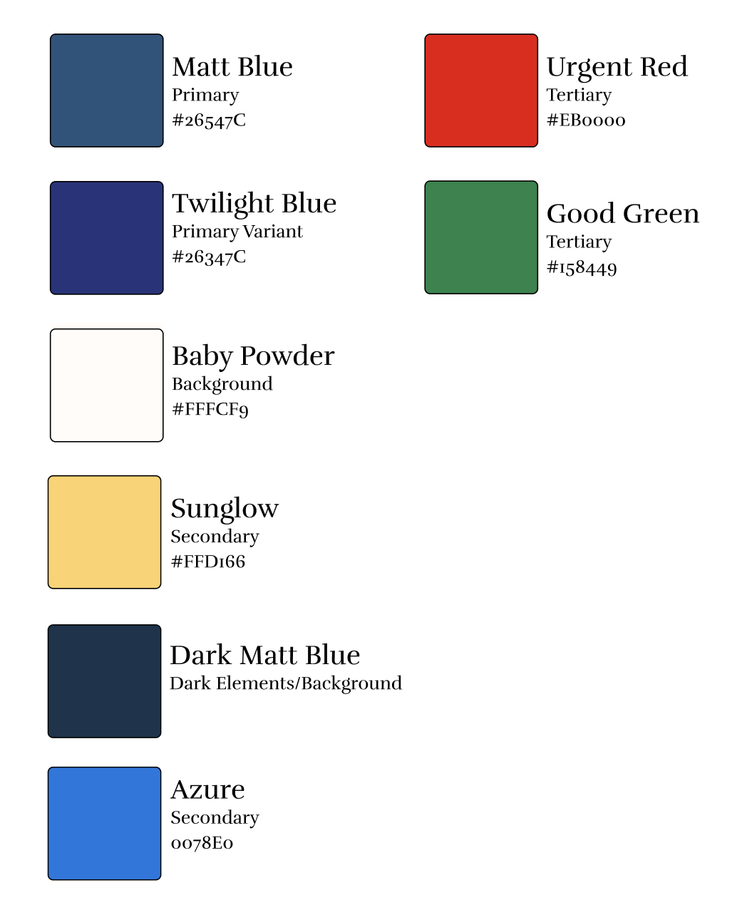
Color choices:
I played around with a few color combinations until I landed on dark blue and gold yellow. Dark blue to cool and relax the user as managing inventory is usually stressful (particularly during a count). The dark gold holds the user’s eye to the navigation bar mimicking the use of old external scanners. Azure, Urgent Red and Good Green were all established to meet accessibility standards while remaining readable.
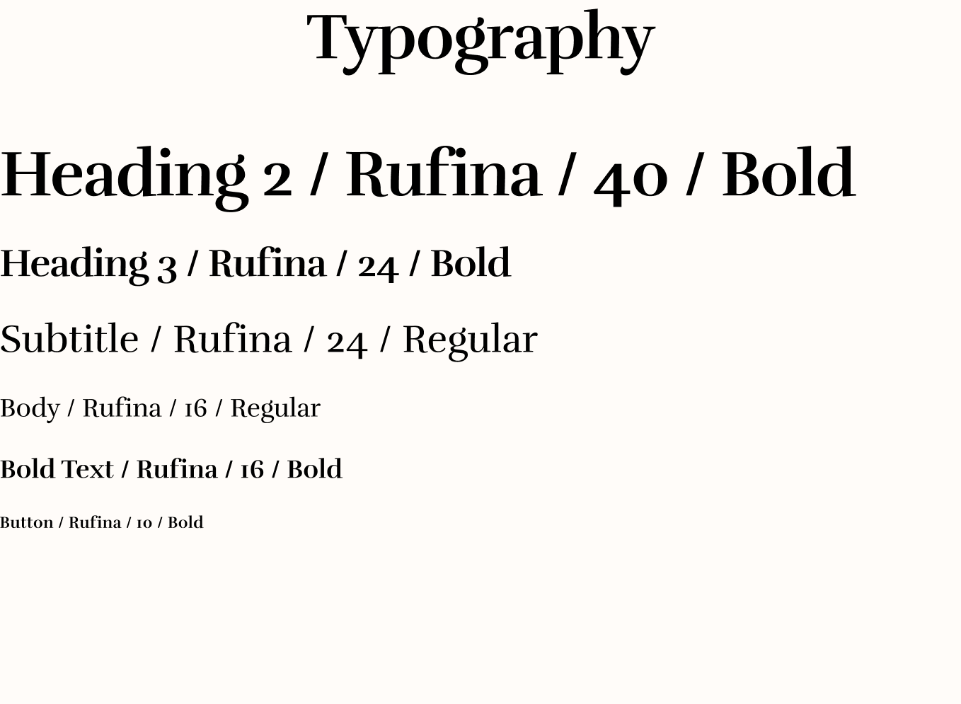
Typography choices:
I wanted to present an ecological based branding recognizing that all our resources come from our home planet. This typeface evokes the tradition of writing, while remaining readable for scanning through inventory cards. I wanted the text to differ from the typical orthogonal angles that inventory environments have. This breaks up the visual monotony while easing the eyes.